Work In Progress and Portfolio Edit
- Laura Marsh
- Mar 7, 2021
- 4 min read
Here I have tried out another shot of the red leaf I took recently. I wanted to see how another angle would appear or how affective it would be. Comparing the two, I feel the first edit, looking straight down on to the leaf is the better version as there is less negative space around it and more of a focal point on the leaf and its details.

These are different from my other images, much lighter due to the snow and with little or no vignette. I wanted to focus on something other than leaves, as these were all hidden at the time under the snow. I found a plant that had been blown or moved onto the pavement, into the path of walkers and cyclists. In the first image, the plant is still intact, just, but you can see how fragile and vulnerable it is lying on the snow, almost waiting to be broken. Having shown this in my 1:1 with my tutor, an observation was made by them that it could be cropped to reduce the negative space, something I had not considered and will try out in another edit.
The second image, I feel is the strongest out the two. It is of the same type of plant, but this time it has been stepped on and crushed. You can see the debris surrounding it along with the footprints and bike tracks in the snow. I felt this encompassed my idea and meaning of fragile structures and how vulnerable they are.


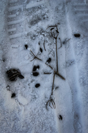
Fig 2-3: Laura Marsh, 2021, Snow and Snow #2, Fragile
I tried out some more A4 prints, this time I wanted to see the quality of the dark background more on the matt paper and how these three images appear printed. I am still impressed at the quality and I am considering printing one at a larger size via a printing company to see how the quality would be then. I may use Harman Labs as they do now print colour images and I will explore their services, if so, I will order one print to test out the process.

HDR:
I tried another HDR test using Snapseed and Lightroom on my phone, of a leaf laying over the pavement and a join to a manhole. Its location drew me to it and the way it was still intact but could be damaged at any moment. I like how it laid over both surfaces, almost cutting the frame up by having the join run through the top right corner. This is different to what I have done before, where I have removed or avoided surface details, but I wanted to explore the composition on this occasion. I think it works, but at the same time I have lost the dark background which almost alienated the subjects from their surroundings and not giving the viewer details of their locations or surroundings. I feel this leads the subjects to appear more vulnerable, removed visually from their place.

The texture and contrast in this image (fig 6) came out much better than I expected, and I love the pavement colours that have come through, it almost feels tactile, and you can see the wet pavement shining against the dull decay of the leaf. I use the macro setting on my camera to get as close to the leaf’s structure as I could to capture the swirls and patterns which I was not aware Holly leaves had. I have saved this leaf to re-use in a still life setting, it has now dried out and in a different state than it was in the photograph, which will be interesting to explore and see how delicate it is now.

This reminds me of Ruskin’s approach of looking at nature closely to understand and explore its beauty.
“Being aware of how we see the world is intimately bound up with the other things that mattered to Ruskin: learning to draw; taking our time as we stop to look” (Fagence Cooper,2020:41)
Fig 7, this again, is a slightly different shot, the leaf has not yet decomposed and is covered with snow and ice crystals. I was drawn to that mainly and using the macro setting I was able to get closer to show the structure of the snow more that the leaf. I do not feel this image works as well and does not fit my intent as well as previous images I have taken.

Portfolio Review Curation
Series of photographs documenting my editing process.
I printed off all images I have so are and arranged them on the floor in a random order to see how they all looked. From this I could easily cut out those that did not flow or follow my intent, mainly those taken at the start of the module when I was still exploring my idea. These photos are for my own reference mainly to refer to each time I removed or moved a photo’s position, finally settling on the final 12, in the order I will present them. This order was decided on the content of each image, their relationship to each other and how they appear visually together in sequence, trying to avoid any close repetition of similar subjects.


Fig 8-14: Laura Marsh, 2021, Portfolio Edit Documentation
References:
Suzanne Fagence Cooper. TO SEE CLEARLY : Why Ruskin Matters. S.L., Quercus Publishing, 2020, p. 41.
Figures:
Fig 1: Laura Marsh, 2021, Red #2, Fragile
Fig 2: Laura Marsh, 2021, Snow, Fragile
Fig 3: Laura Marsh, 2021, Snow #2, Fragile
Fig 4: Laura Marsh, 2021, Print Tests
Fig 5: Laura Marsh, 2021, Fragile
Fig 6: Laura Marsh, 2021, Fragile
Fig 7: Laura Marsh, 2021, Fragile
Fig 8-14: Laura Marsh, 2021, Portfolio Edit Documentation


Comments